


Want a spa‑calm bathroom that still feels current in 2026? Start with the right color palettes. They set the mood, guide finishes, and make small spaces work smarter.
In this mobile‑first guide, you’ll learn how to build calming and trendy palettes, pair paint with tile and stone, and test choices before you commit. Ready to design your 2026 sanctuary with thoughtful palette planning?
Calm first: map tonal ranges
Start with mood. A bathroom palette should guide routines toward ease, not stimulus. Map tones before picking specific paint or tiles.
- Define the feeling: spa-like calm, cozy warmth, or quiet drama.
- Set a ratio: the 60-30-10 rule for base, secondary, and accent.
- Select undertones: warm, neutral, or cool to steer the vibe.
- Check light reflectance value (LRV) to manage brightness.
- Plan finishes: matte, eggshell, or satin for walls; honed vs. polished tile.
For small baths, a base color with LRV 70–80 feels airy without going sterile.
Build your matrix on paper: three base options, three secondary mid-tones, three accents. This keeps choices focused and helps you test swatches strategically under morning and evening light.
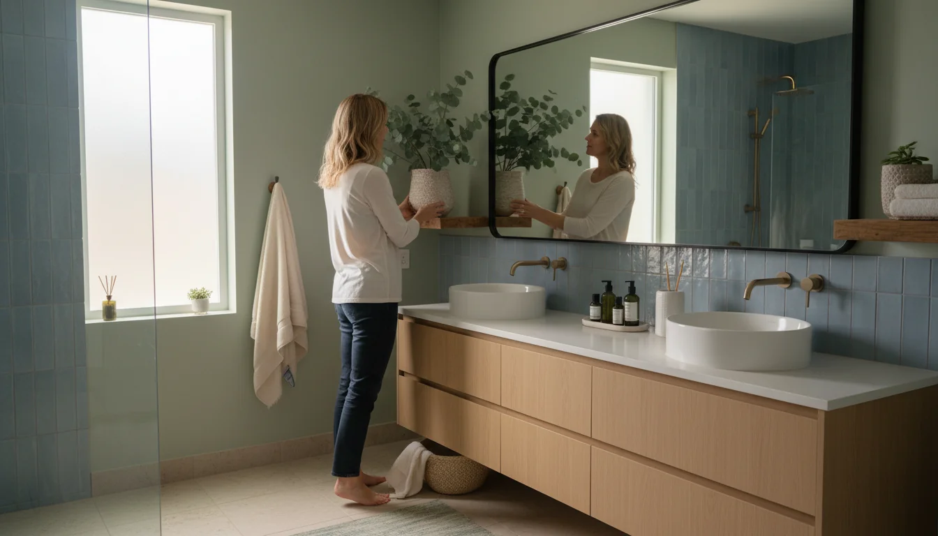
Warm serenity: earth‑neutral sets
2026 bathrooms lean warm and grounded. Earthy neutrals create a serene foundation that feels modern, not flat.
- Base tones: oatmeal beige, soft taupe, gentle greige.
- Secondary: sand, clay, mushroom-inspired neutrals.
- Accents: toasted almond, light caramel, terracotta tint.
- Materials: light wood, tumbled stone, linen textures.
Anchor warmth with a mid-tone vanity and keep walls two steps lighter for a balanced gradient.
In real spaces, this family thrives with brushed warm metals and soft white ceilings. It pairs well with ribbed tiles or limewash for tactile calm.
If you like accessorizing by color family, explore a coordinated bath mat selection that echoes your base and accent tones without visual clutter.
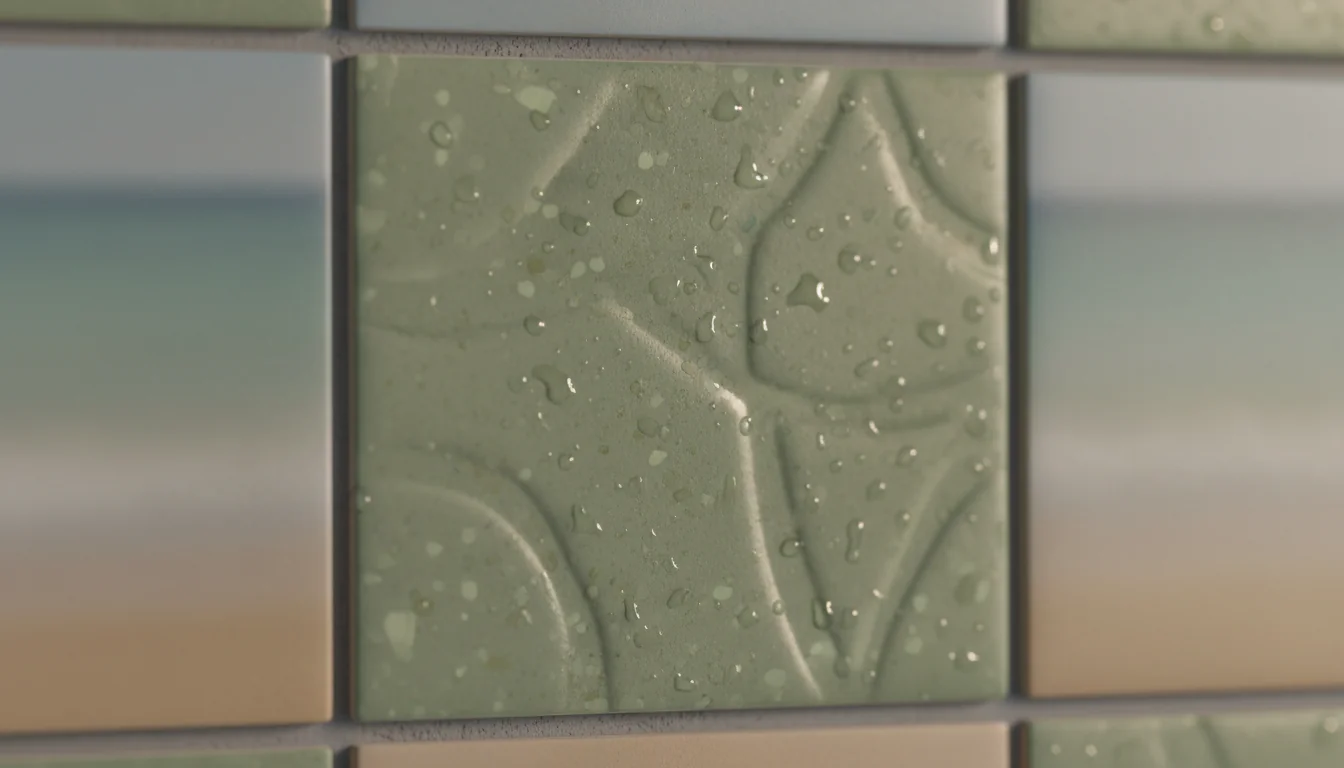
Spa balance: nature‑green harmonies
Muted greens bring restorative energy in 2026. Think sage, eucalyptus, and mossy mid-tones layered over warm foundations.
- Use greens as the 30% mid-tone on walls or cabinetry.
- Balance with creamy off-white ceilings for lift.
- Pair with stone-look tile or pale travertine for softness.
- Add blackened bronze or muted brass for contrast.
Greens swing with light. Sample at three heights and recheck after 24 hours to catch undertone shifts.
For small baths, keep greens dusty rather than saturated. Add texture—fluted fronts, woven baskets—to avoid a flat, painted look.
Need more coverage underfoot? See our oversized rugs range to extend the palette across the floor and reduce visual breaks.

Quiet drama: blues and darks
Deep blues, charcoal, and soft blacks add intimacy without heaviness when layered thoughtfully. They’re ideal as accents or for color drenching in powder rooms.
- Choose a single dark accent wall or vanity to ground the room.
- Use satin on woodwork, matte on walls for depth contrast.
- Counterweight with warm tile, natural wood, or brass.
- In low light, prefer blue-green slates over pure navy.
Color drenching—one hue on walls, trim, and ceiling—creates a cocooning effect perfect for evening routines.
Blues excel near natural stone with gentle veining. Keep grout low-contrast to avoid visual noise and maintain a tranquil read.
For a finishing touch that matches a statement scheme, explore design-led options that echo your accent hue without stealing focus.
Airy light: soft whites layered
In 2026, whites are textured and gentle. Choose soft off-whites with subtle warmth to brighten spaces while preserving softness.
- Aim for LRV 75–85 in windowless baths.
- Prefer cream-leaning whites over stark, clinical tones.
- Layer with microcement or limewash for movement.
- Add pale sand or khaki accents for quiet contrast.
Match ceiling white to the wall hue at half strength to reduce harsh breaks and keep the palette seamless.
Soft whites let textures do the talking: ribbed tile, woven stools, and brushed metals add dimension without pushing the room brighter than needed.
Texture matters: pairing surfaces
A strong palette is also tactile. In 2026, bathrooms blend stone, tile, wood, and soft metals to create depth that reads calm on mobile-sized views and in real life.
| Palette family | Best finishes & pairings |
|---|---|
| Earth neutrals | Honed limestone, light oak, linen, warm brushed metals |
| Muted greens | Travertine, tadelakt, ribbed tile, blackened bronze |
| Deep blues/darks | Matte walls, satin trim, veined stone, warm brass |
| Soft whites | Limewash, microcement, pale sand tile, champagne metal |
Keep grout within one tone of the tile. High-contrast grout can fragment otherwise calming palettes.
Aim for three textures max: one stone, one tile format, one metal family. This restraint supports the palette and avoids “busy” reads.
Guide 2026: build your palette in 5 steps
- Define the vibe: spa‑calm, earthy, or moody luxe.
- Select a base family and two supporting tones.
- Add one accent and one metal finish.
- Mock it up: swatches + tile + grout + textiles.
- Test under real light; adjust contrast if needed.
Create a flat lay and photograph it. Your phone reveals clashes your eye may miss.
Need a soft pattern to break up neutrals? Try a floral bath rug idea that echoes your accent without raising contrast.
Prefer a modern edge? Ground the space with a graphic‑textured rug option in the same undertone family as your tile.
Designing a nature‑leaning scheme? Reinforce the spa feel with a nature‑soft rug pick that ties green or clay notes together.
Why choose coordinated palettes for bathrooms?
Because palettes deliver clarity. You get a calmer look, faster decisions, and fewer mismatches across tile, paint, and metal finishes—especially important in small rooms.
How do curated schemes compare to mixing as you go?
A set scheme reduces risk. You can still add personality with accessories—think this heart‑motif mat—without disrupting undertones or balance.
What are the core 2026 bathroom color families?
Warm neutrals, muted greens, dusty blues, and clay‑inspired earths. Keep contrast low for calm, then layer texture for interest.
Do these palettes work in low‑light bathrooms?
Yes. Use warm off‑whites and mid‑tones with matte or honed finishes. Add layered lighting to prevent shadows from dulling color.
How do I maintain a palette over time?
Keep the base stable; swap accents by season. A small piece—like a playful frog mat—refreshes the look without repainting.
What mistakes should I avoid?
Error to avoid: mixing cool gray tile with warm paint. Always align undertones and test with your actual lighting before install.
Bathroom color trends in 2026 revolve around thoughtful palettes—calm bases, tactile layers, and accents with intention.
- Keep contrast low for serenity and visual flow.
- Match undertones across materials before you buy.
- Use one accent strategically and repeat it twice.
Start small, test under real light, and let your palette guide every choice—your daily routine will thank you.
0 comments