


Slips in the tub are silent, fast, and preventable. Visual cues matter as much as traction. Are you making your bath brighter and safer—or harder to read?
In this 2026 guide, you’ll learn how clear or colored bathtub mats improve visual safety, how to choose high-contrast options for low vision, and how to install and maintain non-slip protection without guesswork.
Contrast that reduces falls
Visual contrast is the fastest way to boost bathroom safety. The goal is simple: make the mat’s edge and surface immediately visible against the tub or tile so feet find stable ground on autopilot.
- Light tubs (white, light-colored): pick dark-colored or medium gray for a clear edge.
- Dark tubs or floors: use white or pale textures for sharp separation.
- Busy tiles: choose a solid color, not a pattern that hides edges.
- Glass or glossy surrounds: favor matte surfaces to cut glare.
High contrast matters most at the mat’s perimeter. If you can’t see the edge instantly, change color or finish.
Clear mats can work if the tub is uniformly dark or if you need to see drain holes. But when vision is reduced, color contrast often outperforms transparency for day-to-day safety.
Workplace color-coding (like ANSI/OSHA signage) exists to communicate hazards at a glance. Your bath benefits from the same idea: contrast cues guide safer foot placement.
If you’re torn between clear and colored, test visibility with the room lights dimmed. Nighttime perception often decides which option truly supports visual safety.
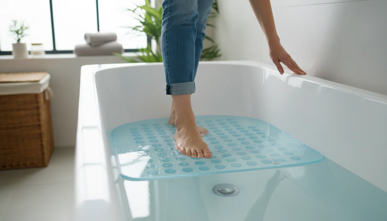
Traction where it counts
Color helps you aim your step; grip keeps you upright. Prioritize non-slip texture, stable coverage, and secure attachment for consistent protection in the tub and shower.
- Non-slip texture with raised nodes increases underfoot friction.
- Suction cups or peel-and-stick backing prevent mat drift on smooth tubs.
- Drain holes reduce standing water and mildew risk.
- Full-length coverage (e.g., extra long formats) supports safe entry and exit.
Traction fails on soap film. Always install on a clean, smooth surface and re-press cups weekly to maintain hold.
For visually impaired users, tactile feedback is essential. Choose a surface you can feel with your toes before committing your weight—this tactile “stop sign” complements visual safety.
Pair the mat with grab bars at entry points. One steady grip plus sure footing reduces slip risk dramatically.
If mats lift along the edges, swap to a design with more, smaller cups. Many small anchors resist peel-up better than a few large ones, preserving day-to-day safety.
Light, glare, and edge clarity
Even perfect color choice fails if glare washes it out. Tune your lighting so the mat’s boundary, texture, and drain openings stay readable from any angle.
- Use warm, even light to reduce mirror-like reflections on glossy tiles.
- Add motion-activated night lights along the path to the bath.
- Favor matte finishes on surround elements near the tub.
- Aim task light at the floor, not at eye level, to lower glare.
Emergency egress markings emphasize visible edges under low light. Borrow the idea: highlight the tub threshold or first step with contrasting tape.
For households with glaucoma or macular degeneration, bright, uniform light helps maintain contrast and supports reliable visual safety during bathing.
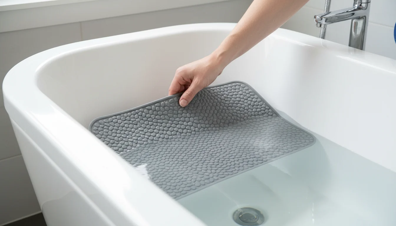
Low vision: cues that guide
People living with low vision often rely on strong color differences, simple shapes, and consistent layouts. The bathroom should make choices obvious and obstacles rare.
- Keep a bath-mat in the bathroom at all times—consistency reduces guesswork.
- Use a contrasting toilet seat for faster orientation.
- Hang dark towels on light walls (and vice versa) near the tub edge.
- Avoid stripy or high-complexity patterns on floors and mats.
Black mats on white floors can appear like a “hole” to some dementia patients. Favor light-colored or mid-tone options that keep the floor looking continuous.
If touch helps more than sight, choose a mat with a pronounced, even texture you can feel before stepping. Tactile cues add another layer of safety.
Contrast strategies work across the home. In the kitchen, Adaptive Plates, Plate Guards, Bowls, and Redware Tableware make light or dark foods easier to see.
Clear vs colored: quick comparison
Use this snapshot to decide which option enhances visual safety in your specific space. Contrast, glare, and cleaning routine will tip the balance.
| Clear bathtub mat | Colored bathtub mat |
|---|---|
| Preserves tile look; good if floor itself is contrasting or dark. | Best for immediate edge visibility on light tubs and pale tiles. |
| May disappear on white tubs; add matte finish to reduce glare. | Solid colors avoid “visual noise”; patterns can hide boundaries. |
| Shows soap film; clean often to keep visual safety intact. | Pick light vs dark to contrast with your background surfaces. |
Fast test: take a phone photo from doorway height. If the mat edge vanishes on screen, it’s not providing enough visual contrast.
Match your background to your mat in reverse—light with dark, dark with light. That simple pairing drives most of the safety gain.

Maintenance that preserves grip
Clean surfaces are safer surfaces. Soap scum is slippery and dulls color contrast. A quick, consistent routine keeps traction and visibility high.
- Rinse after each use; hang to dry fully.
- Weekly: scrub both sides, cups included; remove film on the tub floor.
- Monthly: disinfect; check for cup fatigue and edge curl.
- Replace if the mat won’t re-adhere or color is too faded to guide steps.
Never install over textured or damaged tubs; cups won’t seal reliably. That undermines both grip and visibility.
If mold appears, intensify drying and consider a design with better drainage. Smooth drying surfaces maintain hygiene and visual safety.
How to set up a safer bath mat (2026)
- Degrease the tub floor; rinse well. Any residue reduces suction.
- Wet the surface; press cups from center outward to expel air.
- Align for contrast; ensure the edge stands out from surroundings.
- Test traction barefoot; check no-curl at edges and corners.
- Add a night light path and confirm visibility with lights dimmed.
Mark the “safe zone” mentally: cups fully sealed, texture underfoot, and a visible edge. Recheck weekly for ongoing safety.
Prefer transparency for décor? Consider a translucent option that preserves tile visibility while still providing clear non-slip structure.
Want neutral contrast without visual “heaviness”? Explore a grip-focused gray alternative that pops on white tubs yet stays calm on darker surrounds.
Why prioritize visual safety over style?
Because your eyes guide your feet. Clear edges and color contrast prevent missteps, especially with low vision. Good traction finishes the job, but visibility gets you onto the safe zone first.
Are clear mats as safe as colored ones?
They can be—if they contrast with the background and don’t glare. On white tubs, consider a bright, high-contrast white surface only when walls and floors are darker, so the edge still stands out.
What features matter most to prevent slips?
Non-slip texture, reliable attachment, and obvious edges. Full-length coverage helps at entry and exit. Add grab bars where you turn or pivot for layered protection.
How do I choose for someone with low vision?
Maximize contrast, avoid busy patterns, and reduce glare. Keep the mat in the same spot. Use night lights and tactile texture so toes confirm safe footing before weight transfer.
Does size matter for safety?
Yes. Larger mats cover turning zones and wet areas. Look for a full-coverage non-slip layout that spans the standing length without blocking the drain.
How often should I clean the mat?
Rinse after use and wash weekly. Soap film reduces grip and dulls contrast. Disinfect monthly and re-press cups. Replace if edges curl or cups won’t hold.
What about patterned floors that hide edges?
Use a solid, contrasting mat and increase ambient light. If glare is an issue, go matte. Keep layouts simple so the eye can find the safe landing instantly.
Quick chooser: background vs mat
Pair your surroundings with a mat color that creates immediate, unmistakable separation for visual safety.
| Background | Recommended mat color/finish |
|---|---|
| White or light-colored tub/walls | Dark, medium gray, or bold color; matte to cut glare |
| Dark tub/floor | White, cream, or light gray; visible edge texture |
| Busy patterned tiles | Solid color that opposes the dominant background tone |
| Glossy, high-glare surrounds | Matte finish in a contrasting shade |
If multiple users have different needs, err on the side of stronger contrast and simpler layouts. That choice helps everyone.
Visual cues plus reliable grip make bathrooms safer. Choose contrast that jumps out, anchor the mat securely, and maintain cleanliness so performance never fades.
- Contrast first: light vs dark to spotlight edges.
- Texture and suction keep footing dependable.
- Dry fast and favor mildew-resistant surfaces for lasting hygiene.
Apply these steps today so your bath works like a guide, not a guessing game.
0 comments